The Project Overview
| Company | Check |
| My Role | UX/UI Designer |
| Timeline | 3 Weeks |
| Tools Used | Canva Craft Figma Optimal Workshop Whimsical |
Measuring and managing tasks has been a proven method of establishing positive habits and dissuading negative ones. Consistency is key, so ensuring accountability and staying on track is vital however the setup process and configuration process causes more stress than anything else.
To combat this, I was tasked with finding a solution to provide an all-in-one method of tracking the good and the bad when it comes to habits and time tracking.
The Problem
There are numerous day counters and habit trackers available on the market, ranging from standalone apps to integrations and add-ons. Some aim to encourage positive habits, while others aim to discourage negative ones, and some focus solely on tracking progress.
One major issue is that many of these apps do not fully encompass tracking both good and bad habits. Some solely focus on encouraging positive habits, while others solely focus on preventing negative ones. Using two separate apps can create unnecessary pressure and confusion.
The Solution
There are numerous day counters and habit trackers available on the market, ranging from standalone apps to integrations and add-ons. Some aim to encourage positive habits, while others aim to discourage negative ones, and some focus solely on tracking progress.
One major issue is that many of these apps do not fully encompass tracking both good and bad habits. Some solely focus on encouraging positive habits, while others solely focus on preventing negative ones. Using two separate apps can create unnecessary pressure and confusion.


The Background
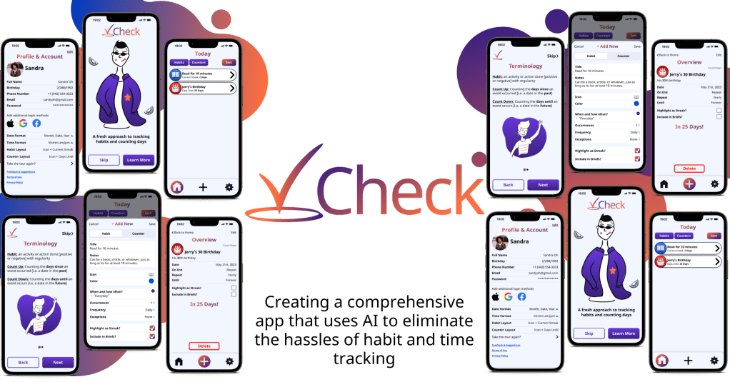
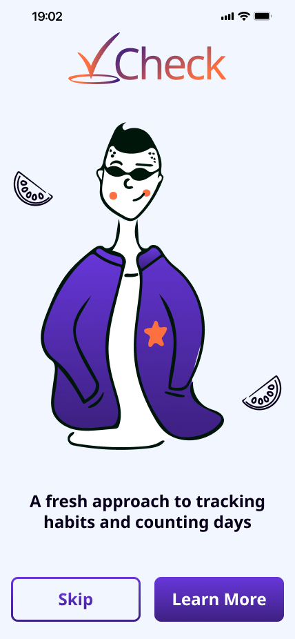
Check is an app designed to help users track their daily habits and measure their progress towards their goals. It provides an intuitive platform to log habits (daily, weekly, etc.) and track progress over time. The app features a simple and intuitive interface that makes it easy to set goals, track progress, and stay motivated. Users can customize the app to fit their individual needs by setting reminders, tailoring it to their preferences, and utilizing AI to streamline the setup process.
Whether you want to build better habits, kick negative ones, track your progress towards a specific goal, or simply stay motivated and accountable, Check is the perfect tool to help you achieve your goals.
The Research
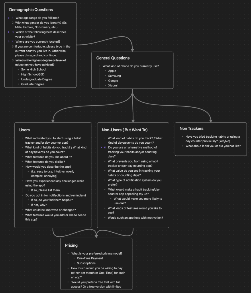
I began with looking into some of the most popular competitors and analyzing their strengths, weaknesses, and overall experience. This revealed potential pain points and gaps in the market, as well as preferences for pricing models and features. Then, I utilized a combination of surveys and interviews to learn more about perceptions, use cases, and common pain points for both users and nonusers.
Research Plan
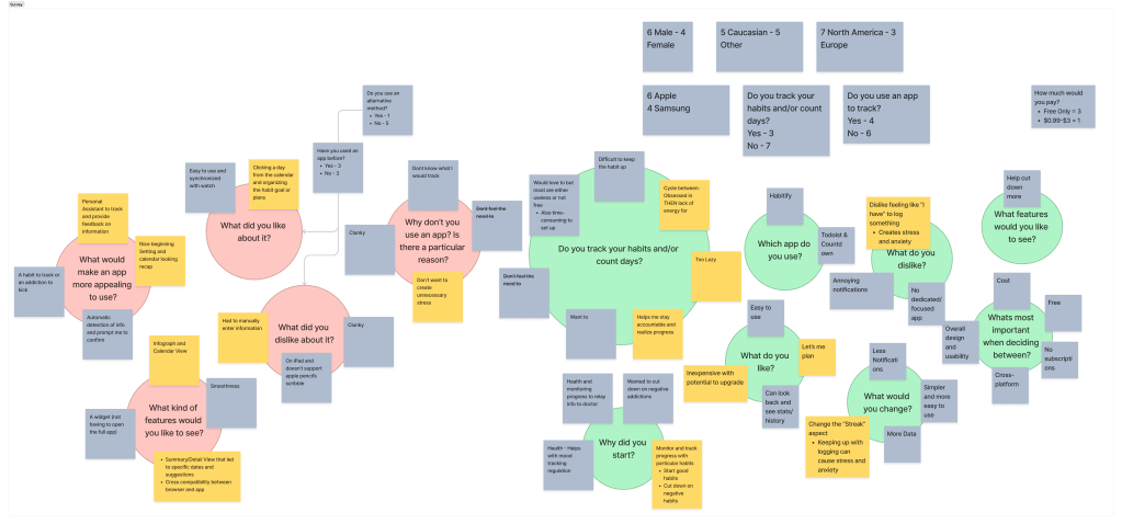
Key Survey Insights
- Stress of tracking habits and/or counting days can lead to vicious cycles of inactivity or disdain for them
- Manually entering in info can be tedious, annoying and not worth the benefit
- While streaks can be helpful for some, they can be detrimental for others.
- This is because they can lead to unproductive feelings of stress and anxiety, despite the same stress and anxiety leading to productive actions by others.
- A solution could be something closer to a personal assistant that alleviates the setup, configuration, and extra effort required.

Key Interview Insights
- Stress of tracking habits and/or counting days can lead to vicious cycles of inactivity or disdain for them
- Manually entering in info can be tedious, annoying and not worth the benefit
- While streaks can be helpful for some, they can be detrimental for others.
- This is because they can lead to unproductive feelings of stress and anxiety, despite the same stress and anxiety leading to productive actions by others.
- A solution could be something closer to a personal assistant that alleviates the setup, configuration, and extra effort required.
Afinity Maps

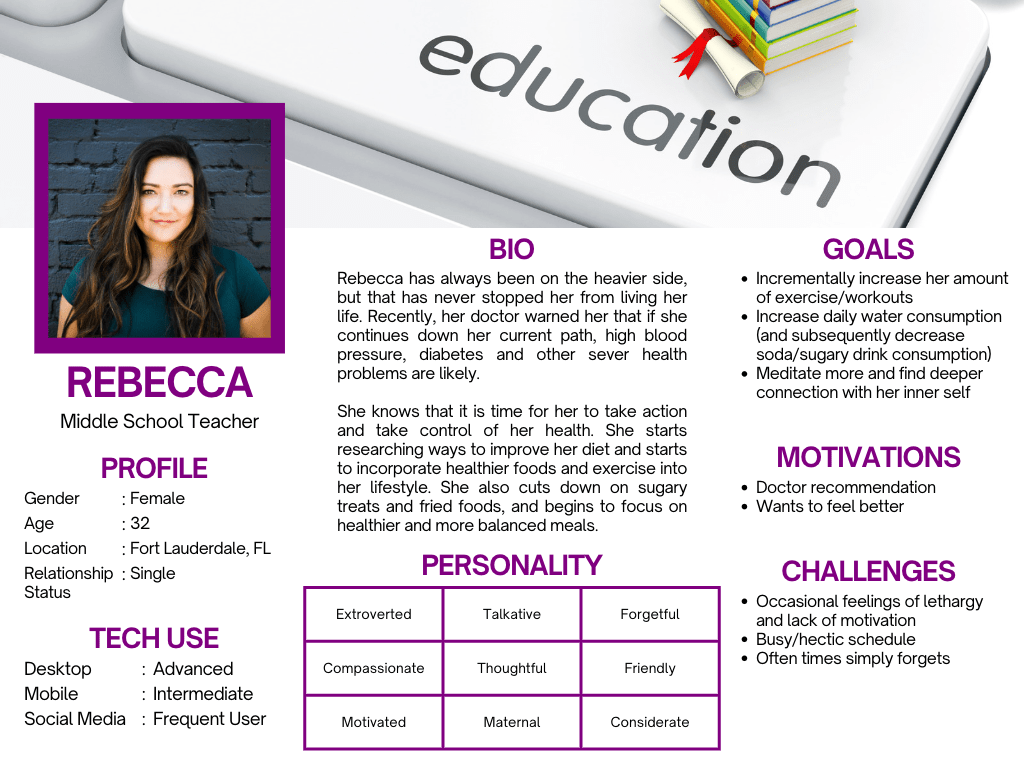
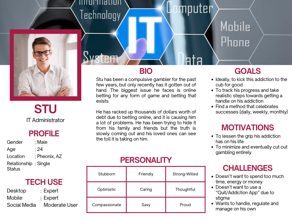
The Users
Based on the insights from my research, I created User Personas (Rebecca and Stu) to better focus on ways of solving their problems. Additionally, I created a few user flows and task flows, as well as developed the feature set. This step proved slightly more difficult as I tried to plan which features would be most important at launch while considering updates for the future.


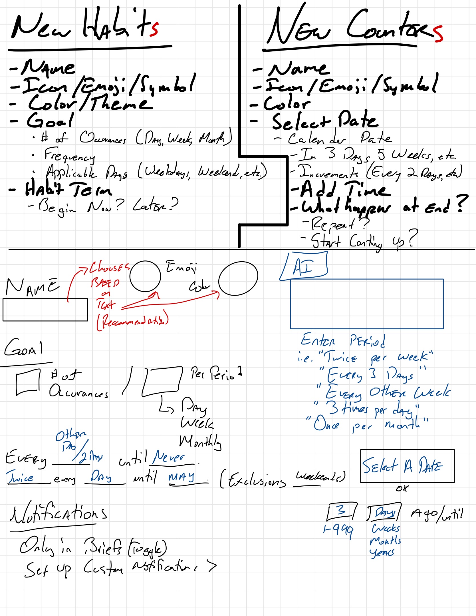
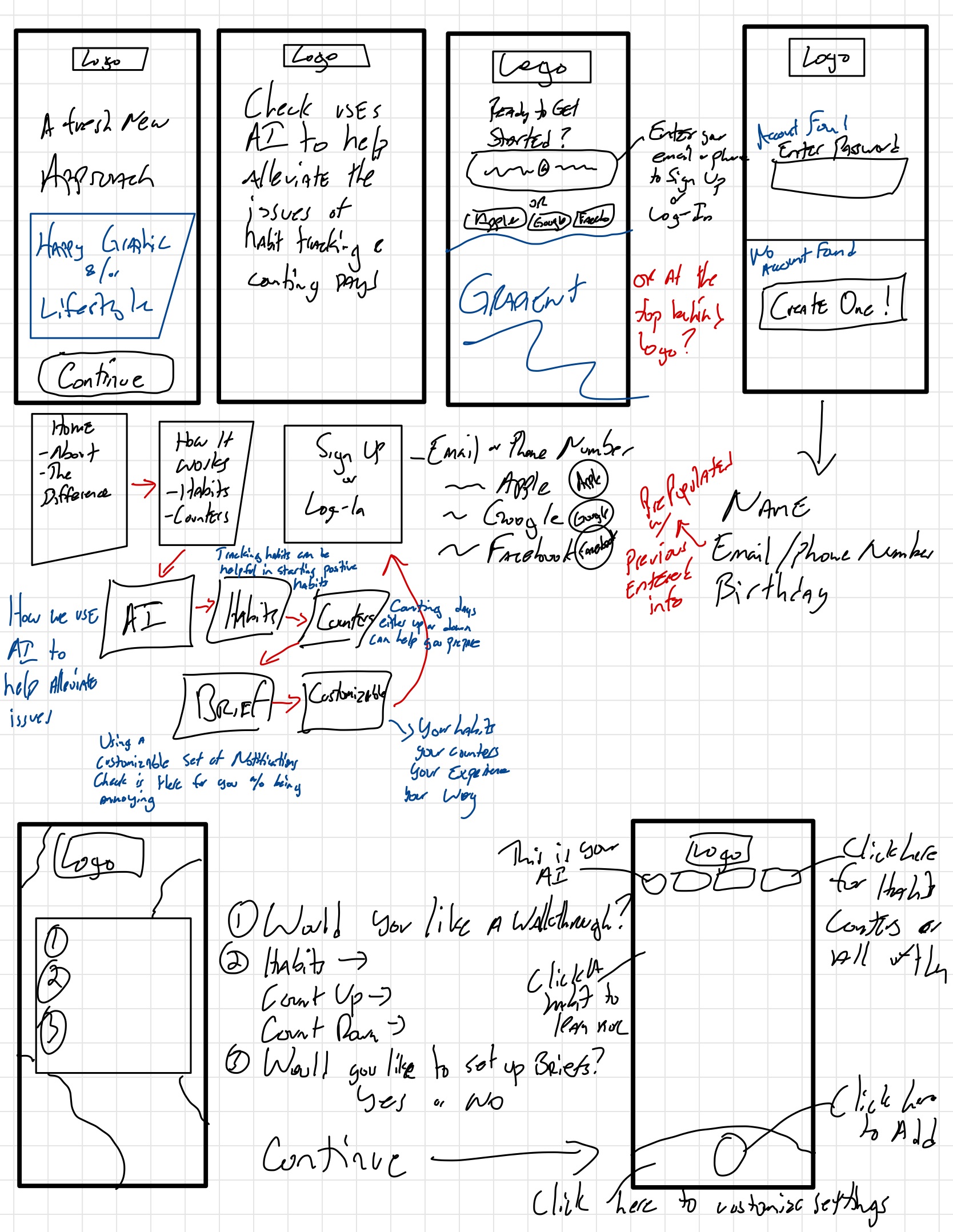
The Designs
Sketching out the main components and how they would fit helped me create a baseline for what I needed most and how everything could be incorporated


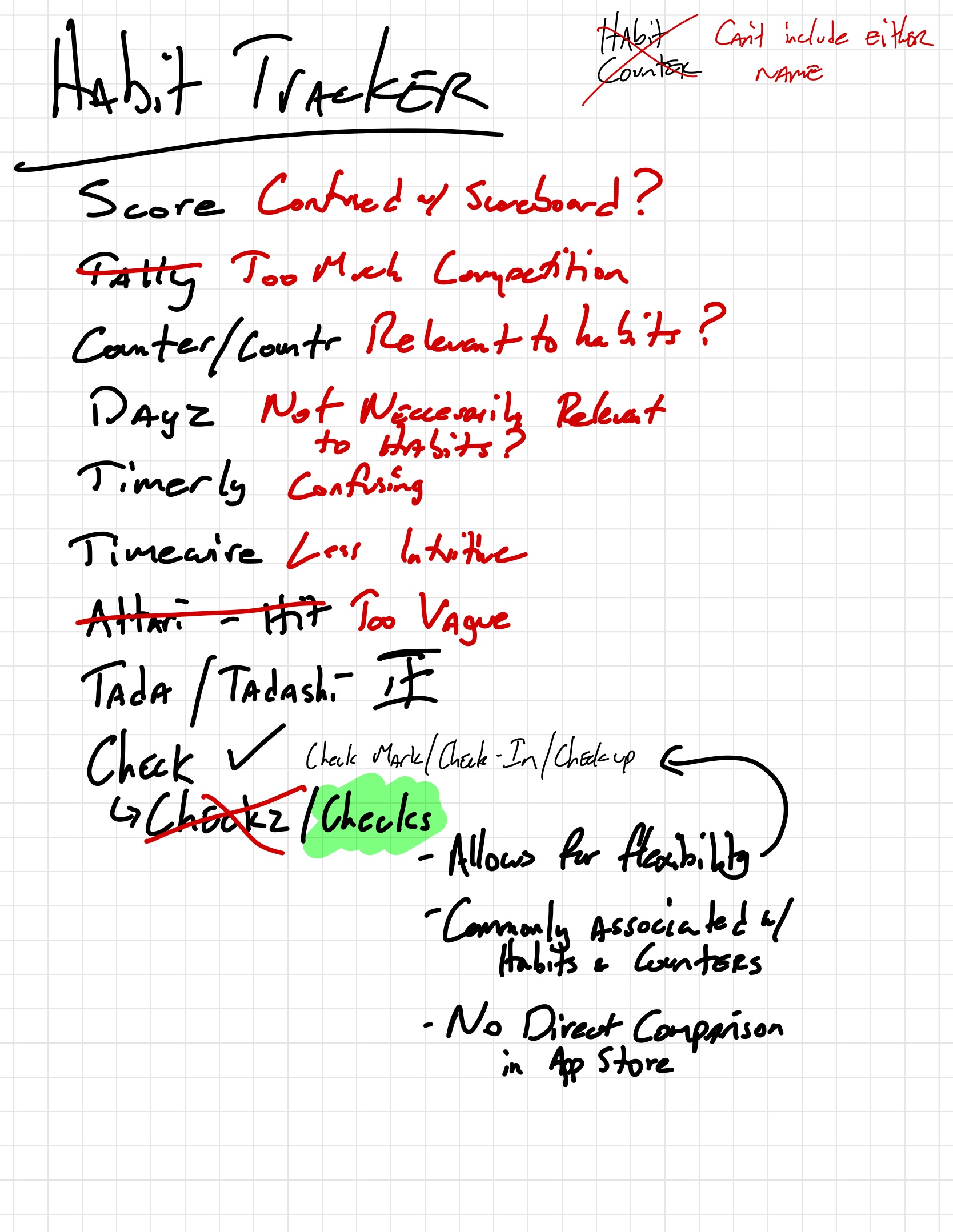

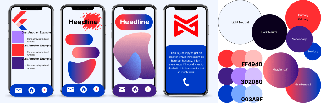
The Brand
Throughout the design process, it was important to ensure that the identity was effective and appealing to a diverse audience. To achieve this, I explored multiple names, logo concepts, color palettes, and dummy layouts to see how everything worked together.

The Wireframes
- Initial setup is a significant source of stress and a barrier for some users. By incorporating AI in the setup process, this pain point could be entirely removed, making the app appealing to both regular and non-users.
- The layout needed to be customizable for each user to optimize their habits and counters. Highlighting certain features like streaks can be motivating or discouraging depending on the user, so it was important to give users control over this.
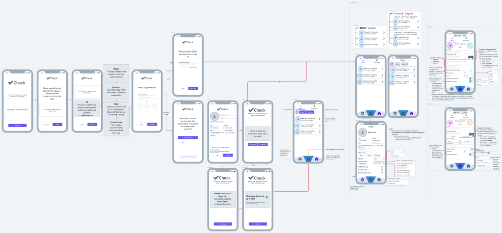
The High-Fi Screens
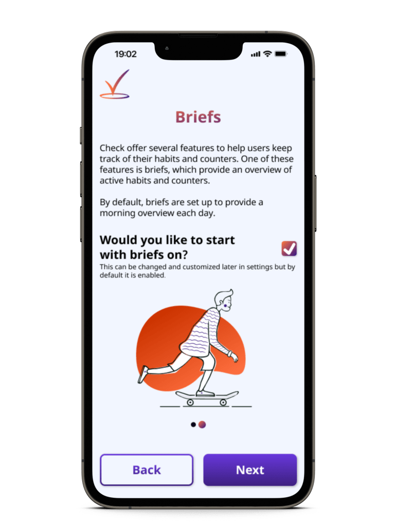
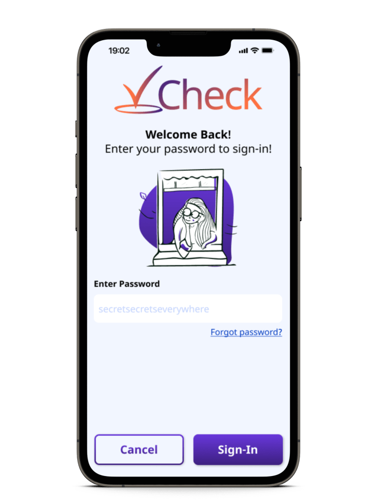
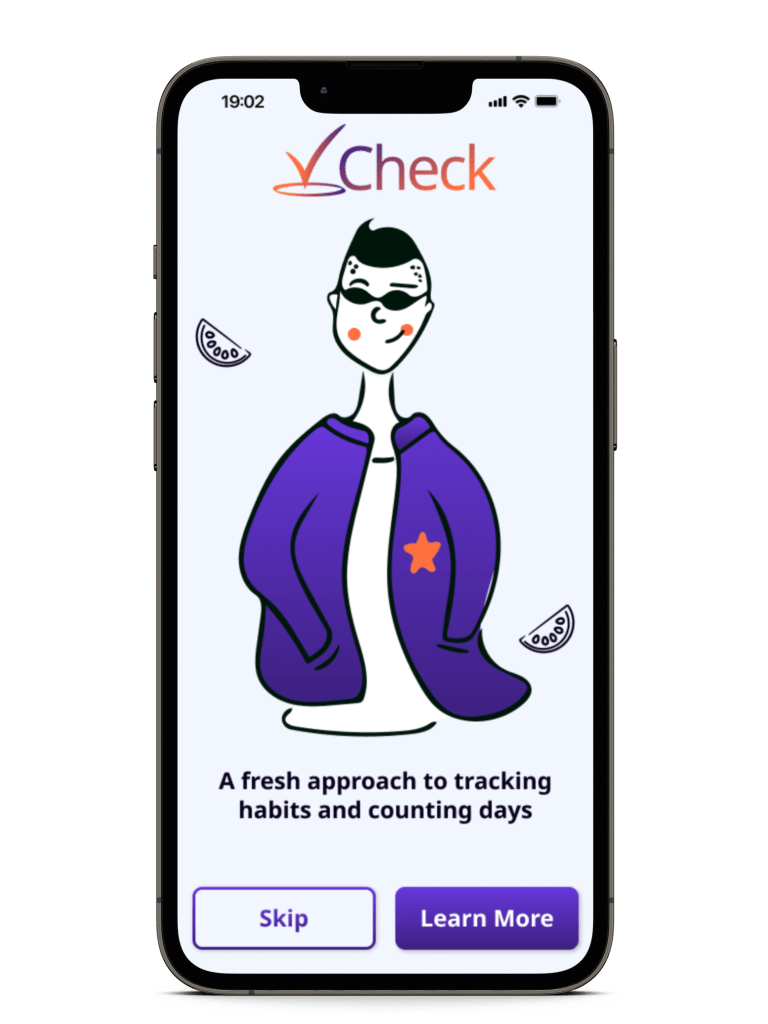
Onboarding Screens
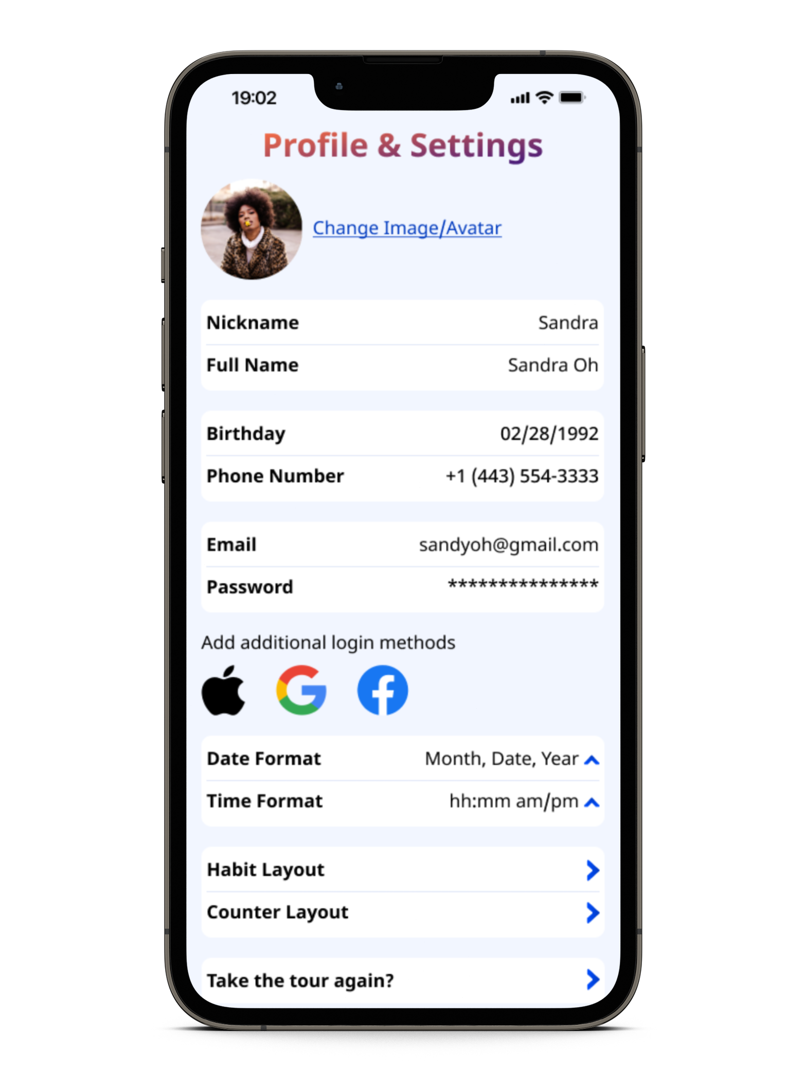
Once I had a better idea of where and how everything would be set up, I began working on the High-Fidelity wireframes. I started by drafting the intro and onboarding screens, followed by the Home Screen and profile/settings screen.


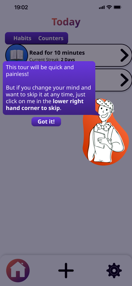
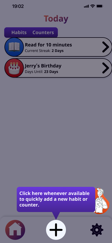
Tour Screens
After finalizing the Home Screen, I used a copy to begin working on the tour user flow, since many of those aspects were dependent on the Home Screen.


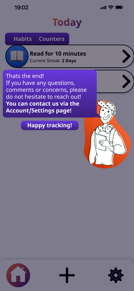
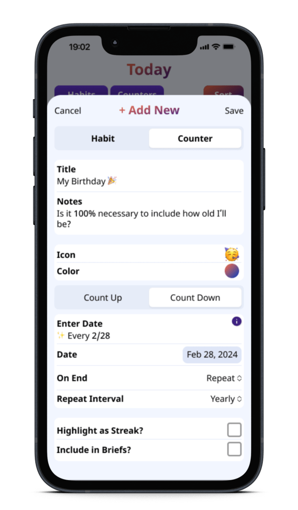
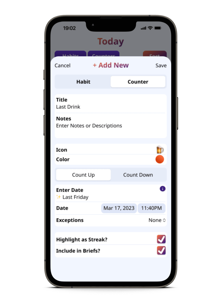
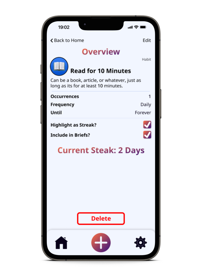
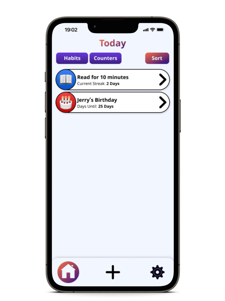
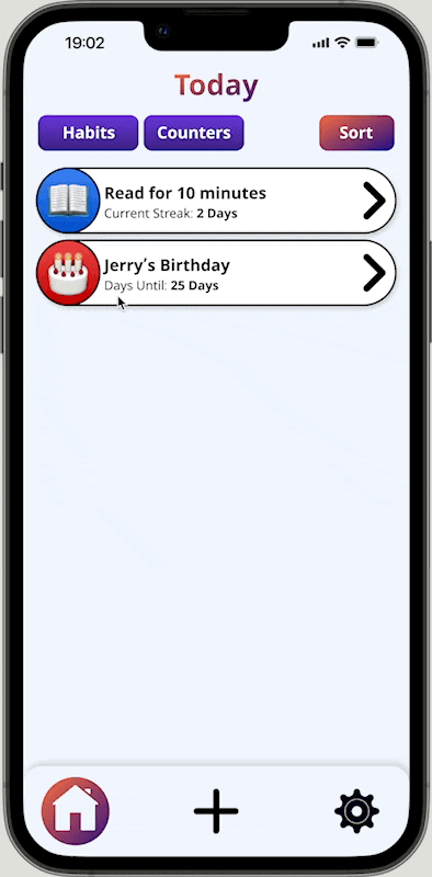
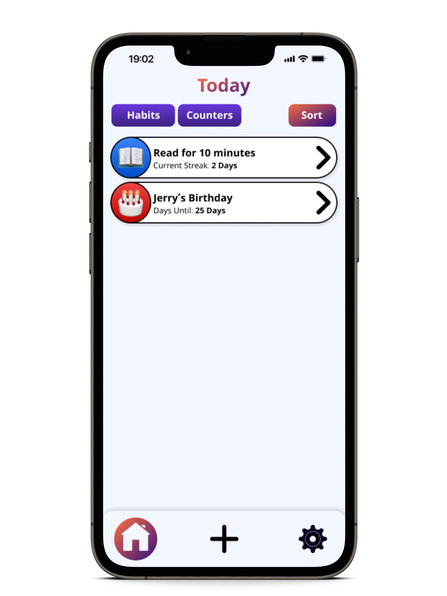
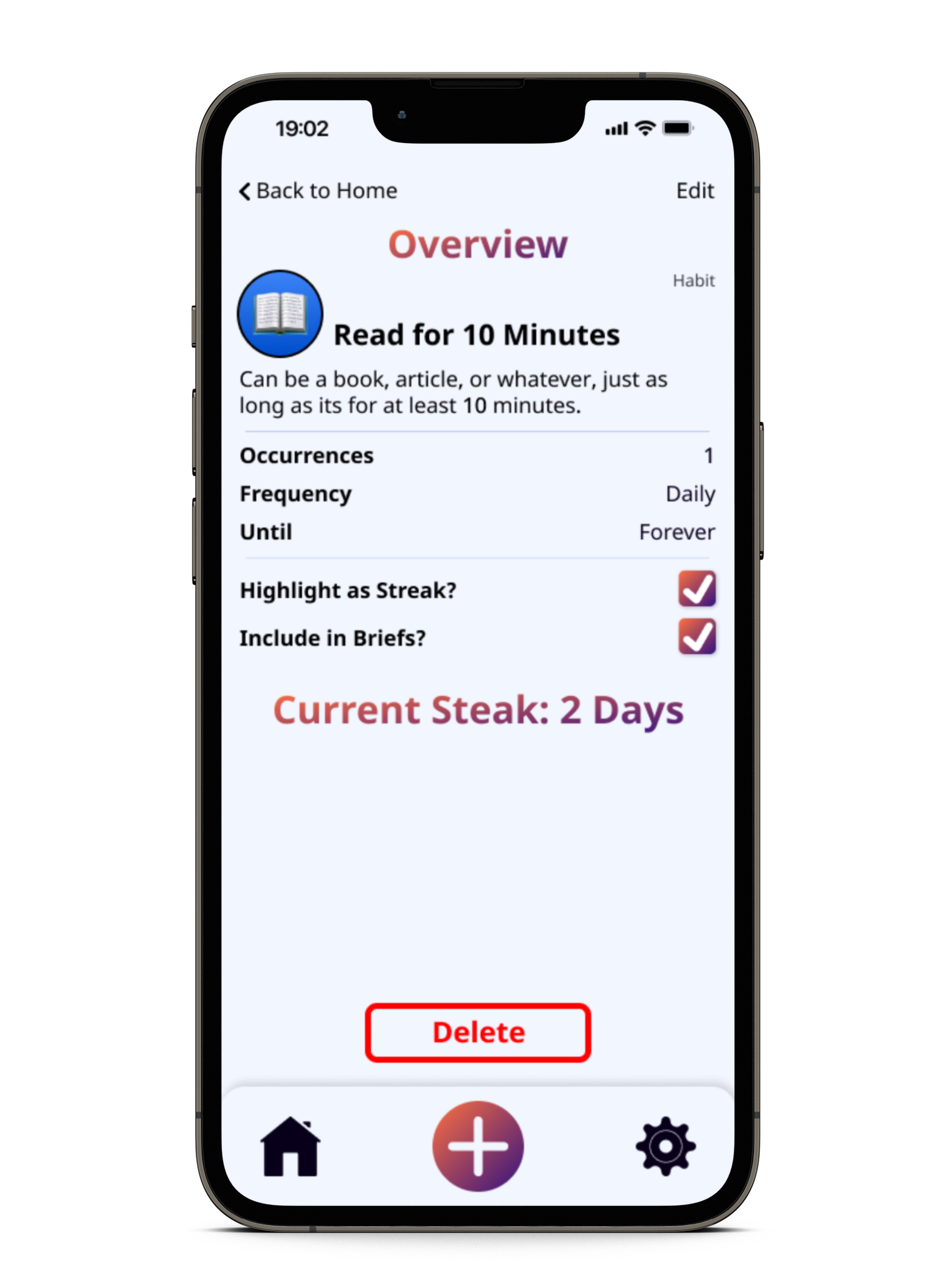
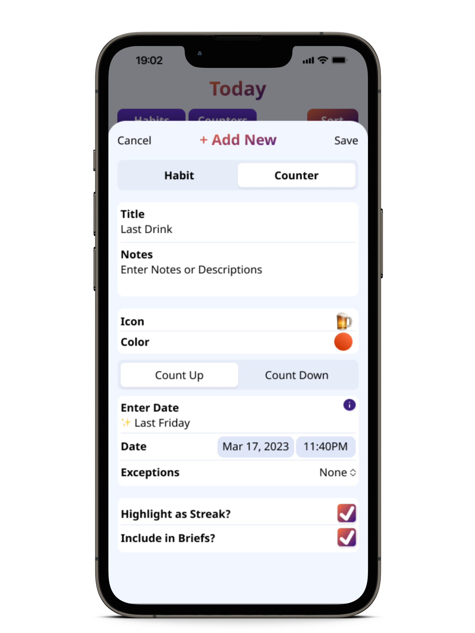
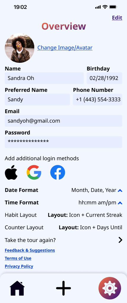
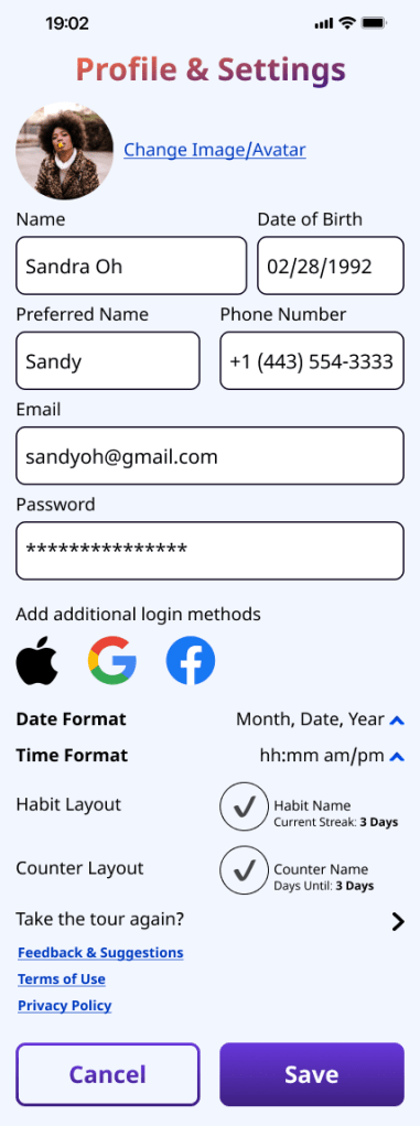
Habit/Counter Screens
The overview and habit/counter screens were the most difficult, simply because I couldn’t decide on the layout. Many of the design decisions for these screens played a larger role in the Profile and Account settings screen as well, since they used similar fields. Changes I made to one eventually affected the other.
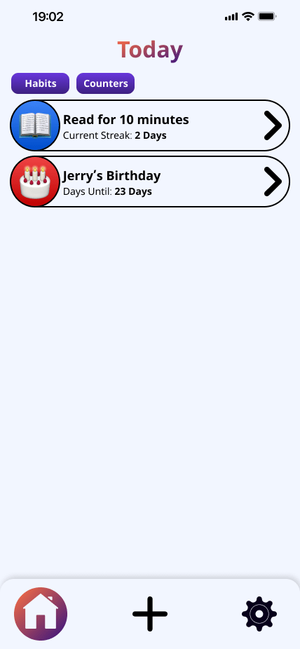


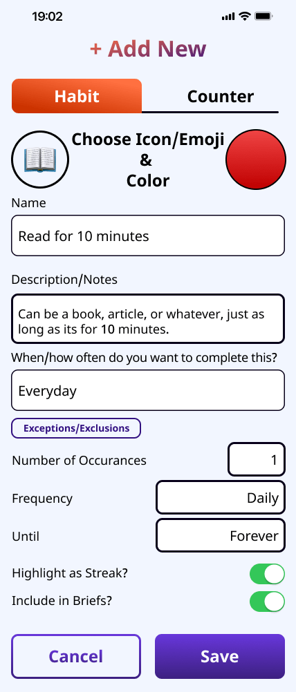
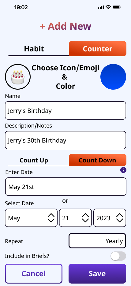

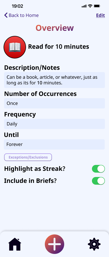
Although this process took slightly longer than I had anticipated, these screens and their functionality were so important that I wanted to ensure they were as intuitive and straightforward as possible.
- Ultimately, if the setup process is cumbersome, time-consuming, or stressful for the user, it could become another pain point or stressor.
THE TEST
I conducted usability testing on the first version of the app with 7 users. Specifically, I focused on user flows. I received a lot of helpful feedback on what worked, what didn’t work, and, most importantly, what could be improved. Some of the most notable feedback included:
- More spacing could be used to improve readability
- Adding new habits and counters was not intuitive enough & approach needed to be reevaluated.
- Accessibility could be improved by adding more contrast and additional space between elements
- Consider creating a more streamlined onboarding process

THE FINALE
After reviewing user feedback, I decided to revamp the style of select input fields and the Habit/Counter screens to look more modern and updated. My goal was to better integrate the style of native iOS apps, which allowed for a more streamlined approach that better utilizes space.

To fully explore this experience, I created 3 separate screens, each with 2 examples for Habits and Counters (Count Downs and Count Ups). These screens were then integrated into the prototype.
The Mockups