

There’s something about tiger lilies that I have always found beautiful. These, in particular, with their burgundy spots scattered across coral petals like paint splatters, the way they curl back on themselves with complete confidence. In this little mini-series (only three shots), I found myself contemplating more than just editing presets as I reflected my own artistic expression and evolution.
What I’m Looking At
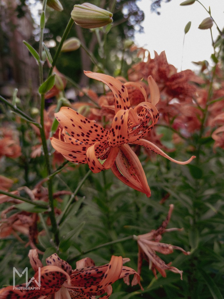
This first photo immediately screams retro, with its muted aesthetic, which also aligned with my intention. Multiple flowers shown here in the frame but with a clear subject to focus on. The greenish sky tint from this random preset adds a vintage film quality, I imagine, reminiscent of discovering forgotten Polaroids in an attic. Although, this is probably more accurate in theory than in practice nowadays. The darker greens create depth without demanding too much attention.
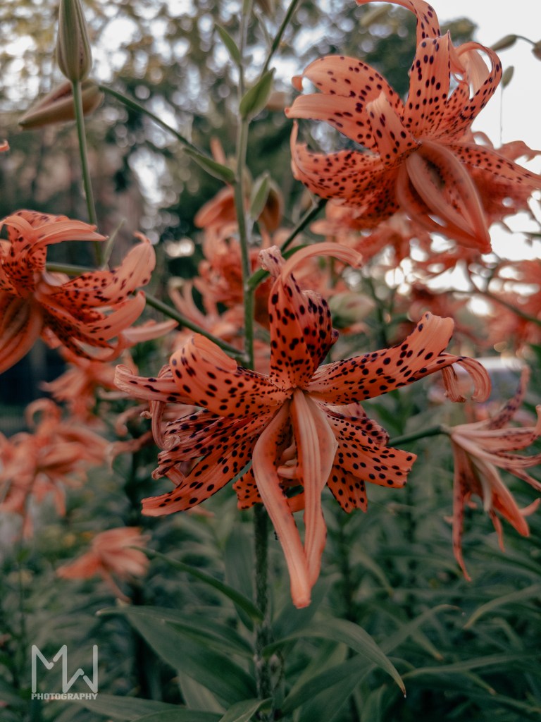
The second shot gets more intense. Having a base or reference from which to work, this one allowed for more experimentation. One lily takes center stage while its companions blur into suggestion behind it. The moody and intense dark greens are what I enjoy most in this particular shot.

Then comes the third image, and I took a hard left or right turn depending on where you may be standing. This is where I threw that particular preset aside and went with a more dream-like aesthetic. The contrast between sharp foreground and dreamy background creates visual layers that feel more like memory than anything else. The grain becomes part of the story, adding texture where ordinarily, you might expect smoothness. That blurred building in the background dissolves into pure atmosphere. The flowers + the background + the texture = this dreamlike retro summer vibe I am somewhat obsessed with.
The Technical Journey That Became Something Else
This whole series started as a simple preset experiment to find and apply the same edit to multiple images and see what happens. While that definitely did not happen, this experiment evolved into something better: a reflection on artistic expression. Traditionally, my editing style involved intense saturation and excessive amounts of contrast. Here, I chose to experiment a bit with more muted tones and less contrast.
That grain in the final shot? It shouldn’t work with such a dreamy aesthetic, but it does, at least in my opinion. It’s like embracing the happy accident, letting imperfection become part of the aesthetic rather than fighting against it.
What It Made Me Realize
These tiger lilies, blooming at the height of summer in Chicago, embody an awareness of their own fleeting nature. The retro preset doesn’t just change their color, but also positions them in the realm of memory before they’ve even faded. That dark greenish tint feels like looking at summer through old glass or on antique paper, making everything feel slightly more precious because, in the back of our minds, we know it cannot last. Too philosophical?
Breaking My Own Rules
This experiment forced me to confront something I’ve always avoided: applying a single preset to multiple images. Historically, I have always operated under the assumption that each photo should be unique, but perhaps that’s just another creative constraint to reconsider. When dealing with larger quantities of photos, such as for an event or a wedding, using presets can obviously be beneficial. I’ve also held the self-imposed belief that presets should only be used with images taken under similar conditions or with the same settings. However, this isn’t always true. By using a preset as a base, I discovered the freedom to better focus on the unique characteristics and attributes of each image and then edit them to reflect that.
It is not necessarily a “spray and pray” approach, but more intentional and deliberate. To me, this allows for deeper reflection and provides an opportunity for more expression. It’s about understanding that constraints can be liberating instead of limiting. Operating within specific parameters can genuinely broaden your expressive range.
The Bigger Picture
I think what I like most about this series is how it captures not just flowers but a moment of creative transition: the courage to soften when everything I thought I had been told demands harshness. Additionally, to mute when traditionally I have always been all about the saturation.
The grain in the third photograph reminds me that texture and imperfection can coexist within the same image, and it is doesn’t always have to be just one or the other. Sometimes, the most moving work emerges not from technical perfection but from the willingness to let accident and intention occupy the same space.
If you enjoyed this, you might like some of my other posts.
Or, for a purely visual trip, check out my other galleries.


Leave a comment